-
Accessible voting information: If you can’t find it, is it really there?
Posted on
Sometimes the problem with accessible voting information is that you simply can’t find it While more people with disabilities are voting, there is still a stubbornly persistent voting participation gap between people with and without disabilities, according to Doug Kruse and Lisa Shur’s research for the U.S. Election Assistance Commission in 2020.
Between 2016 and 2020, the percentage of voters with a disability grew from 55.9% to 61.8%. But for voters with no disability it was 62.2% to 67.5% — still a 5.7% difference. Learn more about this research on the EAC website.
The team at the Center for Civic Design wondered how hard it was to find information about independent and private voting across the country. Read their findings on Medium.com.
Why Can’t We Make It Easier To Be Accessible?
Posted on
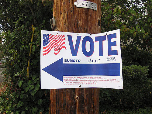
Photo by hjl/CC BY 2.0 The other day, I was doing a final check for a voter guide project. An elections office had created a sample PDF, asked me to check it and identify any problems, then figure out how to solve them. We’d gone back and forth for a few days.
When I finally sent off the email saying all the ducks were in a row, and that the office could start printing the PDF booklet, I breathed a sigh of relief.
And then, like you do, I took to Twitter to share some of my frustration. Much of my time had been devoted to handling the tedious minutiae of setting, checking, and double-checking technical settings I’d chosen in Word–wondering if I’d checked off the right option. So I tweeted this:
It’s not that you can’t create an accessible pdf from an accessible Word file.
It’s that it’s so easy to get it wrong.I didn’t expect the tweet to launch a Twitter conversation that went on for two days. The response prompted me to write a longer form post.
PDFs are not always the best way to share information. Most of the time, you’d find me standing at the head of the line advocating for HTML. Sometimes though, PDFs are the right solution. Particularly for long reports or other documents.
For the voter guide project, PDF is the better option. And assuming you begin with an accessible file, turning it into a PDF ought to be the easiest, fastest way to get from digital source to an accessible printed report. Sadly this isn’t the case.
In the voter guide project I just worked on, the source file was Word. I’d heard that InDesign does do a better job of creating PDF files. And while that’s good advice, it doesn’t address the question of why it’s so hard to make a relatively simple, accessible Word file into an accessible PDF.
Worse, I’ve taken a look at the documentation on creating an accessible PDF from InDesign and it doesn’t look that easy. Powerful, yes. But not easy.
Why does it matter if it’s easy or not? You shouldn’t need an expert to create accessible documents! There simply aren’t enough experts to go around. Templates can help. Cheatsheets and checklists are good reminders. If accessible documents require experts to make them, it’s no wonder there are so few accessible documents out there. Without accessible documents, millions of people lose the ability to get the information to participate in their country’s elections.
But this is about more than elections. In every business and university, people create documents every day. People whose expertise or main focus probably isn’t technology or accessibility. This isn’t a criticism. It’s the real world–and we’re not yet serving everyone’s needs.
Designing for accessibility ought to be easy. It ought to be the default for software. The features to create documents shouldn’t be hidden behind 3 or 4 clicks–every single time you need to use those settings.
Here’s what a typical conversation sounds like helping someone through the process:
Them: I know I’m supposed to put alt text on this image, but I can’t figure out where it goes.
Me: It’s in the formatting properties.
Them: Where? I see Glow and Artistic Effects and things like that…
Me: See the little blue square with the arrows.
Them: Oooooh. That’s where it’s hiding.
And that’s a good conversation. Sadly, too many sound like this:
Me: See the luggage tag on the left. Open that. Now click on the thing that says “Tags” at the top of the panel and…
Them: Wait. What….what is all this? This looks…complicated. How am I going to learn this?
Me: Just send me the file and I’ll fix it.
In both cases, creating accessible information has been made harder than it should be, or downright scary. When accessibility is too much work, it’s a hidden tax.
The good news is we can fix this. I suggest two principles for programs that could make the world more accessible:
Make software defaults that support accessibility.
And make sure the defaults don’t actively harm accessibility. For example, the default Word option to “Bitmap text when fonts may not be embedded” seems like a good thing, but it turns text into little snippets of images. You might not notice this with a visual inspection, but it causes real problems for screen readers. Don’t take the option away…just make it clear what will happen. And don’t make it the default.
Make accessibility features easy to find.
Don’t hide or require several clicks to get to these features. Or make users guess at what they mean. For example, the table property to “Repeat as header row at the top of each page” also sets the row as a header for screen readers, but how would anyone know that this is important (or why it’s important). Maybe the default should be that the first row is set as a heading row. It can be changed, but if you do nothing, you have a more accessible table.
So, what happened to the elections project?
If you’re curious, the booklet was turned into 85 versions. They will be voter guides with information about the candidates and measures on the ballot (along with some basics about ways to vote).
There are 85 of them because there’s not just one ballot for the whole county or state. In New Jersey, where we have a lot of local government, each borough, town, and township has a different ballot. In many places, there are overlapping water districts, fire districts and school districts on top of the boundaries for local offices. I’ve seen the GIS mapping layers for suburban Cook County outside of Chicago, and just thinking about them makes my head hurt.
A large county can have hundreds of different ballots. Even a small county might have dozens. Each is a unique combination of contests for one geographical area. Because the schedule is crazy fast, there’s only a few days between when the list of candidates and measures are certified and when the booklets (and ballots) have to be ready to go to the printer and be posted on the web.
Getting it right is important. The right ballot content. The right languages. The right legal notices. And getting accessibility right, too.
But most of all, easy counts.
It’s the only way we’re going to make real progress.
What you can do
P.S. Since the most obvious recommendation is to “take it up with the vendors” when you have a problem–I did. Because if they never hear about the problems, they can’t fix them. I’ve been talking to both Adobe and Microsoft. They both have online forums. If this matters to you, let them know.
Whitney Quesenbery is the co-founder of the Center for Civic Design. She’s passionate about making interactions with government effective and enjoyable, and bringing more design literacy to elections and government workers. She’s co-authored three books— A Web for Everyone: Designing Accessible User Experiences (with Sarah Horton), Storytelling for User Experience: Crafting Stories for Better Design (with Kevin Brooks) and Global UX: Design and Research in a Connected World (with Daniel Szuc). Follow Whitney on Twitter.
Make accessibility easy, and the world will be more accessible
Posted on
Dear Microsoft Accessibility Feedback,
I suggest you….Help us make accessible PDFs from Office for Mac.
Sign me
FrustratedMaking Acrobat PDF files accessible may not seem like the most important accessibility problem, but give me a second to make the case.
How many of you routinely use PDF files to share documents? And use Office for Mac to create those documents?
I do.
PDF may not be the ideal format for sharing information: even an accessible PDF may not be completely accessible to everyone. But there are times when it really is the best option. Big, long reports. Electronic versions of printed material. Draft documents for comments among people who may use different authoring software.
Like it or not, it’s a lingua franca.
If you use Office for Windows, making a simple PDF file accessible is pretty easy. You start with the built-in accessibility checker. Then you use the built-in PDF creator. End with a final check in Acrobat lets you clean up any problems.
But if you use Office for Mac, there is no built-in checker. No built-in PDF creator. The Mac print-to-PDF creates an image with none of the tags that make accessibility possible.
Why? Why? Why?
Microsoft, Adobe, and Apple are giant companies with plenty of resources and great accessibility programs. So why can’t they get this done? I’ve been asking this question for years, and the answers are always vague, or fingers pointed around the circle.
Come on, guys. It’s not that hard a problem. Get. It. Done.
When Microsoft opened a new forum for accessibility feedback, I added this suggestion:
Help us make accessible PDFs from Office for Mac.
As one commenter says: “It’s ridiculous that the accessibility options I recommend to customers aren’t available on my own device.”
Do you agree? Take a minute to vote it up.
Make accessibility easy, and the world will be more accessible.
A (WIAD) for Everyone: Managing live social media
Posted on
I’m working with World IA Day 2016 – a one-day (February 20, 2016), annual celebration focused on the practice and education of Information Architecture. As accessibility coordinator, I’m helping local events be welcoming to everyone.
 This post, with a template and tips for social media strategy comes from José René Gutiérrez Álvarez (@josernitos). He shared his experience with all the WIAD organizers. This is such great list of tips for live-posting an event that I asked his permission to include it in this series.
 It may seem far from accessibility, but there’s a similarity between live-tweeting and live captions or CART. Most of all, helping people keep track of what happens before, during, and after an event makes it easier for everyone to take part.
A social media strategy, template, and tips
Your event is booked, we are only a couple days till the big day and this is the first event you broadcast on social media, I’m sure there are a lot of questions, and how you manage your local event will depend on the resources you have and also the attendees of your event.
So, let’s start!
Use content you create
As you know, with the agenda + speakers + content of the talks/workshops, you can make lots of content with only those 3 elements.
I recommend this “template”, but you can modify it:
Before the event
- Remind people of the agenda with an image so they can: Share it, comment, save it.
Remind people the location of the event with a Google Map URL or image of the location + image of the venue.
During the event
- Remind people the upcoming speaker/talk, an hour before and 15min before. Could be image or text.
- Post important quotes from the speaker
- If you have the speaker presentation beforehand, make screenshots of important quotes/images you might be able to share. (Ask your speaker first).
- If you want to post photos (cellphone or camera), get help from your team. This task involves being near the speaker, editing the photo or just sharing directly to your feed, but even though you will just take the photo and upload it, there is a lot of content going on: what the speaker is saying, the next speaker presentation, etc. So, If you are a social media team of one, just post 1 or 2 photos of each speaker. Don’t worry if it’s not an awesome professional photograph of the speaker or attendees in the time you have.
- If people are not posting anything, remind your production team to mention the hashtag before the talks
- If there is a broadcast, remind the url for other to watch.
- If there is a broadcast, make screenshots of the event and say something that is happening or saying. People outside the venue want to know if something important is going on.
- Remind the sponsors, local and global that made possible the event.
After the event
- Remember to post the presentations that are public. (Keep a list of urls with name of the talk)
- Remember to thank the organizers of your local event! It’s been a huge task.
- Remember to thank the local and global sponsors.
Include content made by others
I know most of the events will have a huge Twitter impact, but if the attendees are using Facebook or Instagram as their sole main medium of communication, then you should try to get those status updates to nurture your feed.
If there isn’t a lot of content generated by the users, try to see if they are sharing more on other social media, if they are, encourage to use your main social media platform, if all fails, you can create a raffle for the people that send tweets saying they are on the event, or taking a photo w/ their coffee or anything.
Why is this so important? Your event needs to have content generated by the users, that’s why this magic thing it’s called social media. (hehe)
Be prepared for trolls
So you have pre-created some content, people are sharing content (text, links, photos). But there is a troll in the event. Prepare for the worst, definitely this is something you don’t want in your event.
If there is a user or group of users who are making digital noise on the feed, and they are in the event, I have found that the best solution is to point the problem — not on Twitter or Facebook, but to announce the problem you are having. This is really effective method to make people stop the trolling.
A few tips
- Know your audience, understand the influencers of the event.
- Tweet to them directly, make conversation, meet them on the event, people will be more helpful if they’ve seen your face.
- Get to know each speaker, just a quick, hey my name is: _____ and I’ll be the Social Media Manager, so maybe I’ll be taking photos of you, etc. If you have anything you’d want me to publish before/during/after your talk, please tell me/send me the links (videos, audio, etc.)
- Get early to the venue, at least 1 hour before.
- Use wifi, hopefully the venue will have wifi connection.
- Be prepared to run out of juice fast, bring an extension cord, bring extra batteries or external batteries.
- Have a table and chair to use. If you are in just a seat like everyone else it can be awkward to manage everything. If people are publishing a lot of content, it’s better to use your laptop to monitor activity on Hootsuite or another program. Plus having a laptop + phone + battery, is going to be a mess, trust me.
Read all the posts on making a (WIAD) event for everyone
A (WIAD) Event for Everyone – Getting Set for the Big Day
Posted on
I’m working with World IA Day 2016 – a one-day (February 20, 2016), annual celebration focused on the practice and education of Information Architecture. As accessibility coordinator, I’m helping local events be welcoming to everyone.
Just a week to the the 2016 World IA Day celebrations. As you plan the final details, here are a few tips for setting up the room and access to the event.
Start by doing a walk-through from the front entrance to the room. Look for place where people coming to the event might need some direction, even a simple sign. Is it easy to find:
- The accessible entrance to the building
- The path to the room
- The elevator if the event is not on the entry floor
- Restrooms
Inside the room:
- Reserve a few seats at the front for people who need them.
This recommendation comes from the STC Accessibility SIG, which has produced accessibility guides to their annual conference since 2002. They point out that this small accommodation is helpful for many people. They might need to be near the speaker to hear clearly or see the project screen, or have trouble with attention and benefit from the direct line of sight to the speaker.
- Make room for wheelchairs
Be ready to remove chairs to make room for anyone using a wheelchair, as well as for anyone they are with to sit near them.
- Help sign interpreters be visible
If you have sign language interpreters, make time to talk to them when the arrive about how they want to set up. They may also ask you for a list of names or other important technical terms, so they can be sure to get them right. They will also want them in a place where they can trade places without disturbing anyone. And, you’ll need seats near them for anyone relying on them to hear the talks.
Remind speakers:
- Face the audience when they speak.
I don’t mean they have to stand rigidly in one position, but even with a microphone, it’s harder to understand someone if you can’t see their face.
- Speak clearly
Don’t rush through their words. Pause between thoughts. It helps everyone, including people who got distracted for a minute, are listening in a second language. But captioners and interpreters will love them for it.
- Repeat the question
If you don’t have a microphone for the audience, ask them to repeat any questions before they answer them. This not only helps people in the room, but also makes sure that the question is included in any recording.
But, most of all, be a good host, and be ready to help with anything from providing a drinking straw to identifying a place to serve as a lactation room.
A few good articles and checklists
STC Conference Accessibility Guides: How (and Why) They Were Created is an article by Karen Marshal that gives some of the background of this long-running project.
The ADA Voting Checklist was created by the Department of Justice to help election officials check the accessibility of polling places. That may not sound very promising, but it’s actually a useful guide to walking through a public space.
Organizing More Accessible Tech Events is a broader view from an event organizer about creating an inclusive culture at your event.
Planning Accessible Meetings is a list of resources from Accessible Techcomm
Next in the series: Managing live social media
A (WIAD) Event for Everyone – Email and Social Media
Posted on
I’m working with World IA Day 2016 – a one-day (February 20, 2016), annual celebration focused on the practice and education of Information Architecture. As accessibility coordinator, I’m helping local events be welcoming to everyone.
We’re getting closer to The Day. As registration opens, there will be a lot of activity to promote the events on social media and email. Just a few tips to keep in mind to make sure that everyone can read your messages.Let’s start with email. Although many people will allow HTML content in email, many won’t. And the problem gets worse when all of the information is embedded in an image.
I once got an invitation to a webinar that just said:
[ image ] is proud to present [ image ]
No other text at all. Not exactly great communication.
Even with readable text, make sure you don’t bury critical information in images without any other way to read it. This doesn’t mean you shouldn’t use images. Far from it. They can make an announcement sparkle. Just make sure that any information in the image is also available in text:
- If you are sending an HTML email, use “alt text” in the image tag to repeat any information in the image.
- Include the information above or below the image.
For example, if you have a banner with your group name, the location, data, and time of the event you can just repeat it in text. That way, whether the image isn’t loaded or the person can’t read it, they still get the critical information about what, when, where, and how to register.
You can use the same trick in social media: include both the image and enough text to communicate the message (even in 140 characters).
There’s tons of choice in social media managers. Choose one you like, and then use it in an inclusive way. As I was working on this post, Molly Holzschlag* shared a tool with useful functionality and good accessibility. Buffer’s Pablo app lets you add text to an image for posting on social media. It’s quick and easy, but the best part is that it automatically inserts the text from the photo the message text.
A few last thoughts about making email messages and social media posts easy to read:
- The tips for setting color contrast and writing alt text in the post about registration forms applies here, too.
- Check the size of the image and make sure it fits well in a smaller message window. Wide images can also stop text from wrapping, making it impossible to see all of the information on a mobile device. If you are using a message app, be sure to check out a test message on different screen sizes.
- Think about what any image will look like when it’s displayed as a thumbnail–which might be scaled or cropped, depending on the platform.
- Make sure the message comes through with–and without–the images.
- Remember that social media is global, so make the location clear for in-person events.
If you have a good solution for managing social media or a question about how to make it accessible, share it here.
* If you don’t know Molly, just search for “Molly web fairy godmother” or find her on Twitter at @mholzschlag
Next in the series: Getting Set for the Big Day
A Wealth of Personas
Posted on
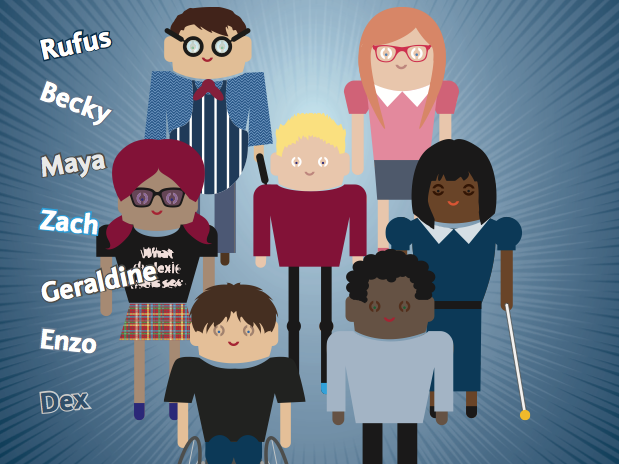
Personas to help UX teams understand how to design for people with disabilities have been popping up on the web.
We love personas and created a group of web user personas to help illustrate A Web for Everyone. While our personas are a good staring point, the most effective personas represent the people in a particular context. We love these two examples of personas for university students and banking customers.
Personas of university students
Mark, from the BC Open Textbook Accessibility Tookit For example, the BC Open Text Accessibility Toolkit, extended and adapted our personas for people who create textbooks, so the personas represent different types of students. Their goal is to help everyone create “a truly open and accessible textbook” because today anyone from an instructional designer to a professor might be a content creator.
To make the more specific to the context, they focused on students with print disabilities, based on data about the tools that university students use and their own focus groups. As an added bonus, they included samples of the assistive technology each persona might use.
Personas of banking customers
The cover of the Barclay’s Diverse Personas booklet showing the 7 personas It’s not surprising to find open access educational projects, but the Barclay’s IT Accessibility Team has made their personas open source to allow others to benefit from their research.
The Barclay’s Diverse Personas are published as a PDF booklet or as a Word file.
Each person includes the top design tips and a detailed profile with information about how they use technology, their life and goals, and banking products they use.
If you are interested in how the team uses the personas, take a look at the case study in the Slideshare presentation Building Accessible Apps: Barclay’s Mobile Banking. It shows how they switched from a single accessibility evaluation at the end — too late to make changes — to ongoing accessibility reviews, starting from the design phase.
A (WIAD) Event for Everyone – Registration Forms
Posted on
I’m working with World IA Day 2016 – a one-day (February 20, 2016), annual celebration focused on the practice and education of Information Architecture. As accessibility coordinator, I’m helping local celebrations be welcoming to everyone.
This month the location pages went live, and organizers started to open registration for the World IA Day celebrations. Many will use a registration platform like EventBrite, because it handles so much of the housekeeping.
Unfortunately, there are no perfectly accessible registration systems, but you can do two things to make sure that the biggest barrier to attending an event isn’t signing up for a ticket.
A few tips for accessible forms
First, whether you are customizing a registration platform or building your own, make the part of the form you create accessible. Here’s a few tips (and some free tools, listed at the end of this post):
- Use good color contrast, especially for important elements like text, links and buttons. The guideline is that the contrast ratio between the text and background should be at least 4.5:1 (for reference, black on white is 21:1). Don’t worry if that doesn’t mean much to you – there are a lot of easy, free tools online that you can use for a quick check.
- Add alternative text to any images. The most important images on registration sites are functional: buttons, informational icons, or credit card symbols. If ithere is text in the image, repeat it in the image tag as alt text. If it’s an icon, say what it means.
- Add labels to forms. If you are writing your own form, connect the field labels to the field. This isn’t as hard as it sounds…even a code duffer like me can do it.
- Add a heading row to data tables. If you have a table with all the different registration options, a few things make it easy for a screen reader to navigate through the details: Just mark the first row as the heading row. (That’s <th> instead of <td> in HTML)
Once you are done, you can check the whole page with one of the accessibility checkers. They aren’t infallible, but they can identify many problems people using assistive technology might run into, so you can know about them (and hopefully fix them).
If there are problems
And that leads to the second thing you can do: offer alternatives and support if someone has problems.
Make sure there’s a way to contact you so you can get them signed up, even after they run into a barrier.
Speak directly to anyone who needs your help so they can have a great WIAD celebration with you.
Tools to help you check accessibility
Color contrast checkers
These tools let you check whether a foreground and background color combination meets accessibility guidelines. The three here also help you adjust or create the color palette for good contrast.
- WebAIM color contrast checker lets you lighten or darken the colors until you find an accessible solution
- Snook’s Colour Contrast Check also lets you experiment to find a good color combination
- Color Safe is a designer’s tool, creating whole accessible color palettes
Tips for writing alternative text for images
- Text alternatives for images: a decision tree – a simple diagram from Dey Alexander, 4Syllables
- Writing great alt text – my slides from the Accessibility Summit 2014
Accessible tables and forms
- Creating accessible forms – WebAim. Code samples and simple explanations
- Creating accessible tables – WebAim. More code samples and simple explanations
Accessibility checkers
These free checkers will analyze the current page for problems and help you fix them
- AXE – The Accessibility Engine – from Deque has browser extensions for Chrome and Firefox that will analyze the current page
- WAVE from WebAIM has an online version and a Chrome extension.
- And, the W3C Web Accessibility Initiative has a long list of more evaluation tools.
Next in the series: Email and Social Media
A (WIAD) Event for Everyone – Captions for Video
Posted on
I’m working with World IA Day 2016 – a one-day (February 20, 2016), annual celebration focused on the practice and education of Information Architecture. As accessibility coordinator, I’m helping local events be welcoming to everyone.
Thinking about planning an accessible event might seem overwhelming for a volunteer group. But it doesn’t have to be. The key is to take it in steps so that accessibility-thinking is just part of everything you do.
This series of articles will help you make sure that your event welcomes everyone, including people who might need help with mobility, vision, or other disabilities. We’ll follow along as you plan your event, with tips and resources.
Captions for Video
The launch of the World IA Day 2016 Teaser video reminded me that we need to talk about captions to make sure that everyone has access to the information in videos, whether they are promos or recordings of a presentation.Little known fact: the U.S. National Institute of Standards and Technology won an Emmy for their work to develop closed captions. The same feature that lets us watch 3 different games at time in a sports bar opens the door to video content for people who are Deaf or hard of hearing.Like so many accessibility features, captions are also helpful for many reasons: Maybe you are in a noisy space. don’t have earphones. Need help understanding the language. In fact, YouTube (and other video players ) use the same features to provide alternative language subtitles – perfect for the WIAD international audience.It’s actually pretty easy to make captions.The good news is that the days of painstakingly figuring out the time codes are long gone. Most of the big video servers have tools that make it easy.The simplest possible situation is a video like the WIAD 2016 Teaser. It has background music, but no speech at all. All we had to do was put in a single caption for the whole video:♫ Music playing ♫It might seem unnecessary since the music is just to set a mood, but with the caption, someone who can’t hear knows they aren’t missing any critical information.What if the video has a voice-over? Chances are you have the script with the text. On YouTube, you can just upload that script and the system will automatically match up the text and create the captions. If the sync isn’t perfect, you can tweak it using the built-in tools.Sometimes, you have no script at all, like a recording of a presentation. When that’s the case, you have to roll up your sleeves for a little bit of work.- The fastest and most accurate way to get started is to make a transcript. On YouTube, you just upload the transcript and the automatic sync process creates the captions, matching the written text using their speech recognition engine.
- You can also use a crowd-sourcing tool like Amara to get many people work together to create captions. Each person can do a little bit of work (or work in a different language), so no one has to do it all.
- If you are working in YouTube, you’ll notice a tool create automatic captions. Unfortunately, it’s not really ready for prime time. The mistakes can be funny, or they can make the captions incomprehensible. Advocates call them “craptions.” But those automatic captions have their uses. Use them as a starting point, download the file and then correct the text as a shortcut to making a good transcript. Saves a lot of time.
Want to make your captions even cooler? Don’t just transcribe the words: add information about sound effects, dramatic information, and identify the speakers.- If there are sound effects, just put it in parentheses: (loud crash) or (phone ringing) or I’ll get that. (phone ringing stops)
- Add dramatic information at the beginning of a line: (WHISPERS) But don’t tell anyone!
- Identify the speakers by adding their name or other info: JAMES SMITH, Hometown Press: I’d like to knowor PRESENTER: Any questions? AUDIENCE MEMBER: My question is…..
Want to learn a little bit more about captions and subtitles?- Audio Accessibility with Svetlana Kouznetsova. In a podcast with Sarah Horton, Sevta shares her dual perspectives as a UX designer and someone who is deaf.
- The National Center for Accessible Media (NCAM) at WGBH in Boston has a great collection of articles
- Captions, Transcripts and Audio Descriptions on WebAIM. Good basics for definitions and examples.
Captioning tools and accessible video players- YouTube captions and subtitles help
- Vimeo video player and creating captions and subtitles on Vimeo
- Amara free captioning tools that support crowd-sourced community captioning
- 3PlayMedia captioning, transcription, subtitling service
- iScribd – online transcription and captions
- OzPlayer – a completely accessible video player, free for non-profit use
- NCAM’s list of free tools including Magpie
If you find another good tool for making video accessible, share it here and tell us how you use it!Next in the series: Registration Forms
A (WIAD) Event for Everyone – Choosing a location
Posted on
I’m working with World IA Day 2016 – a one-day (February 20, 2016), annual celebration focused on the practice and education of Information Architecture. As accessibility coordinator, I’m helping local events be welcoming to everyone.
Thinking about planning an accessible event might seem overwhelming for a volunteer group. But it doesn’t have to be. The key is to take it in steps so that accessibility-thinking is just part of everything you do.
This series of articles will help you make sure that your event welcomes everyone, including people who might need help with mobility, vision, or other disabilities. We’ll follow along as you plan your event, with tips and resources.
Choosing a location
Right now, you are probably just starting your event planning. One of the first steps in having an event for everyone is to make sure your venue is accessible.
Start with a visit to the locations you are considering:
- How will people get to the event? Provide information about parking. Provide information about public transportation, too, because people with disabilities may not drive. Include how to find the correct entrance from the street or parking.
- How will people get into the building? Check whether someone using a wheelchair or with other mobility issues use the main entrance, or do they have to find a special “handicapped” entrance? If the main entrance is not accessible, are there clear signs to point people in the right direction?
- How will people find the meeting room? Check the path from the entrance to the meeting area. Look for good wayfinding signs, clearly marked elevators, and Braille labels for elevators. If the path is hard to find, plan to have good signs and volunteers placed at crossroads who can help direct people.
- * Does the meeting area have facilities for people with disabilities? Check the restrooms near the meeting area and make sure they are accessible. If they are on a different floor or a long way away, check the wayfinding as you did with the building entrance, and plan now for how you will direct people.
Resources for Event Planning
The National Federation of the Blind has directions that include great instructions for someone coming to a new place for the first time. The details are tailored for the blind, but are helpful for everyone. A good model, covering driving, cabs, and public transportation.
The ACM SIG-ACCESS Accessible Conference Guide covers all aspects of event planning, based on their experience running an annual conference for about 130 people that is attended by people with disabilities. In a typical year, there might be attendees who are blind, have low vision, are deaf or hard of hearing, use a power wheelchair or an electric scooter, have limited dexterity, and limited mobility. ASSETS strives to create an environment in which all attendees can participate and socialize together.
As you might expect from lawyers, the Accessible Meetings Toolkit (pdf) from the American Bar Association covers requirements of the Americans with Disabilities Act (ADA), but they are relevant everywhere.
Next in the series: Captions for Video
- Remind people of the agenda with an image so they can: Share it, comment, save it.
A Web for Everyone Blog
Designing Accessible User Experiences
Posts written by Sarah Horton & Whitney Quesenbery